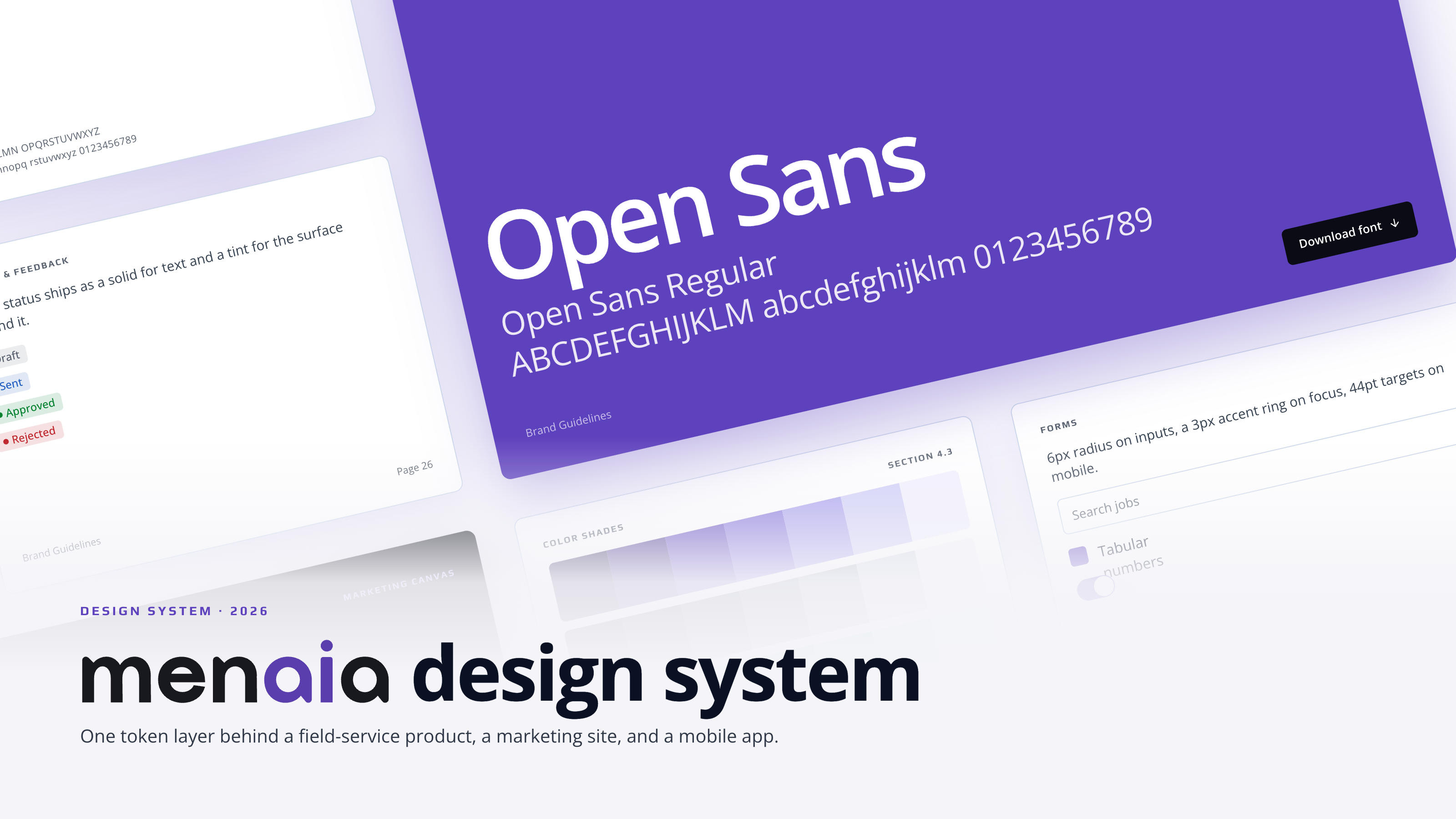
Building a design system from zero
TLDR: Menaia had no brand identity and no design system. I built the system from scratch then carried it through Figma, into Storybook, and then into Claude's design system feature.
Menaia had no brand and no shared parts. The objective was a system the whole team could build from.
That meant getting the brand agreed on first, then turning it into something both design and engineering could actually pull from. What I delivered:
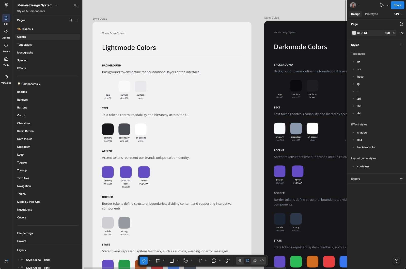
Every token has two layers: a primitive value, and a semantic name on top of it that says what the colour means, not what it is.
A screen references bg-app or text-secondary, never a raw hex. Rename the meaning and every screen follows. Change the primitive underneath and nothing breaks. The Style Guide page documents each one, so the team knows what to use in all the different scenarios.
There were no components to build from, every screen started at zero. The task: a system fast enough that it never held the team back.
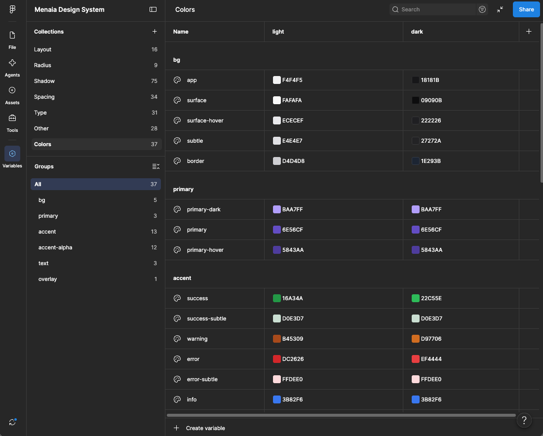
I built the variable library first, so nothing downstream had to wait on it. Light and dark flip with one switch, and layout is a variable too, so components resize across every breakpoint. No duplicate frames to maintain.
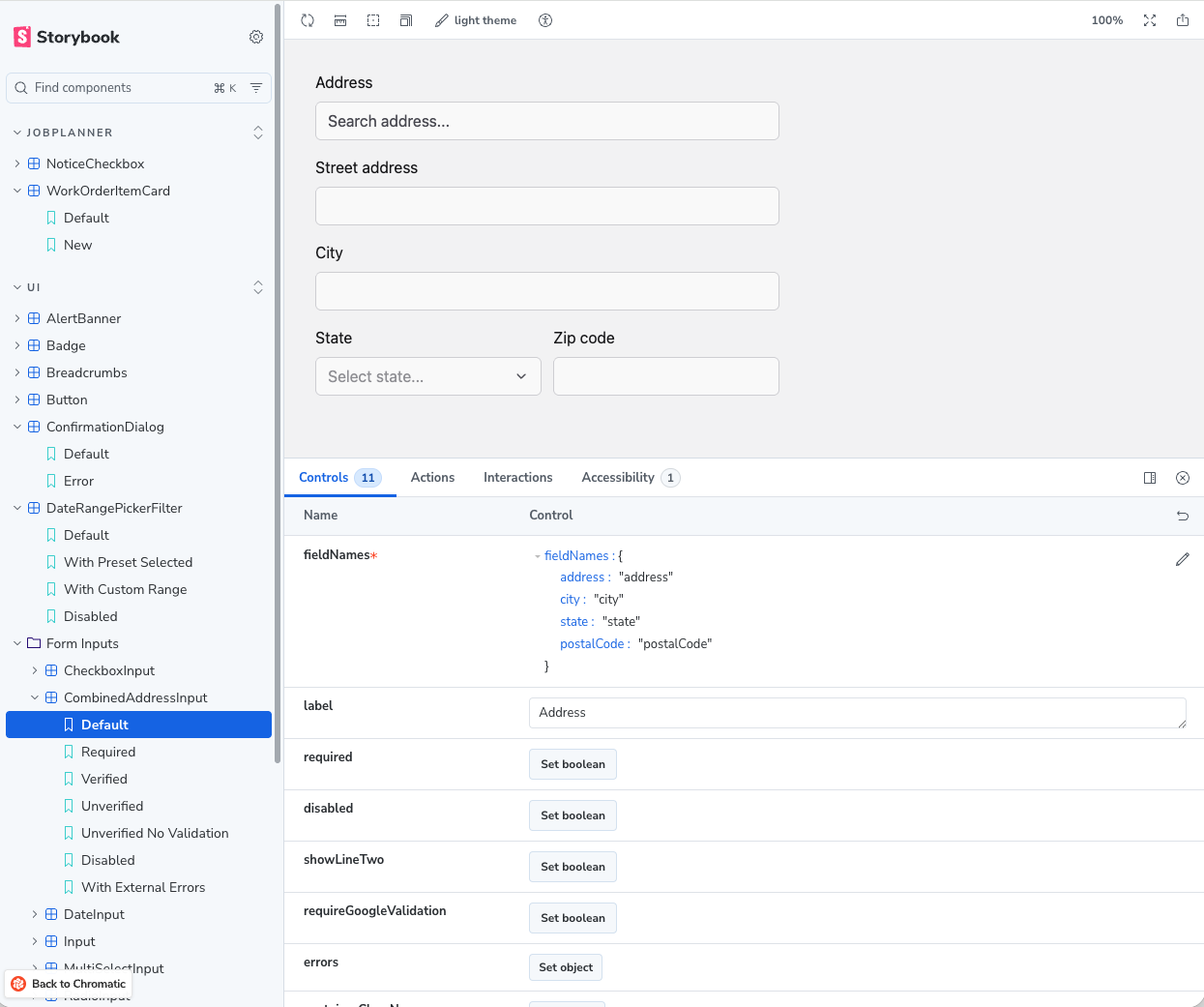
Storybook is where the system met the codebase. I paired closely with engineering so every component, once built in Figma, became reusable in code too.
New patterns got documented with real controls: field names, validation, error states. These are the foundations we needed to set so all of our work stayed consistent, something worth putting in place and investing the time in, so the system could keep improving instead of drifting apart.
I wanted Claude Design and Claude Code to take an idea straight to production, but pulling the system in from Storybook or Figma kept falling apart.
So I rebuilt the tokens and components directly inside Claude instead of asking it to copy them over. That's what made it hold: the same styles now run across the web app, the mobile app, and the marketing site, from one source instead of three.
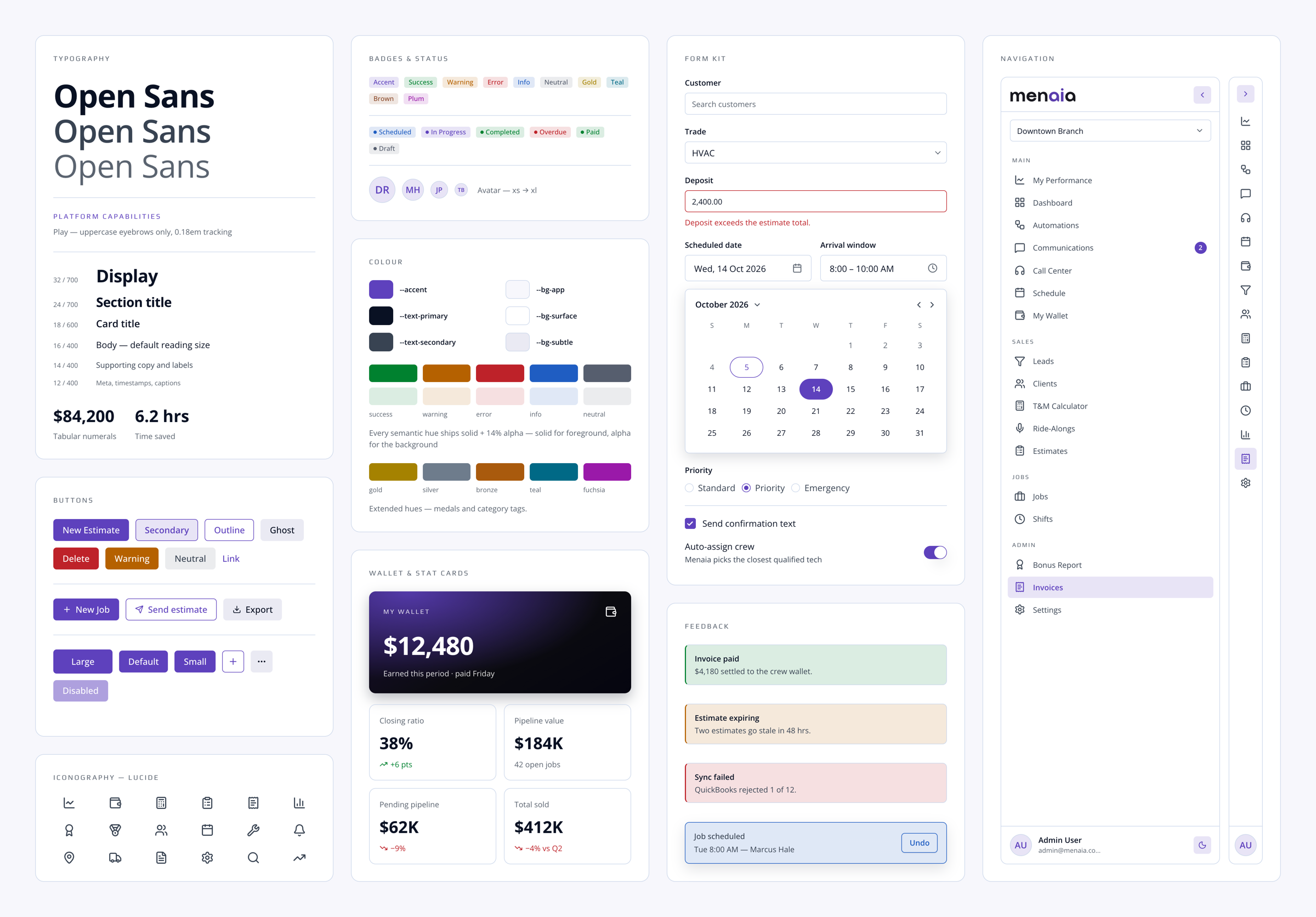
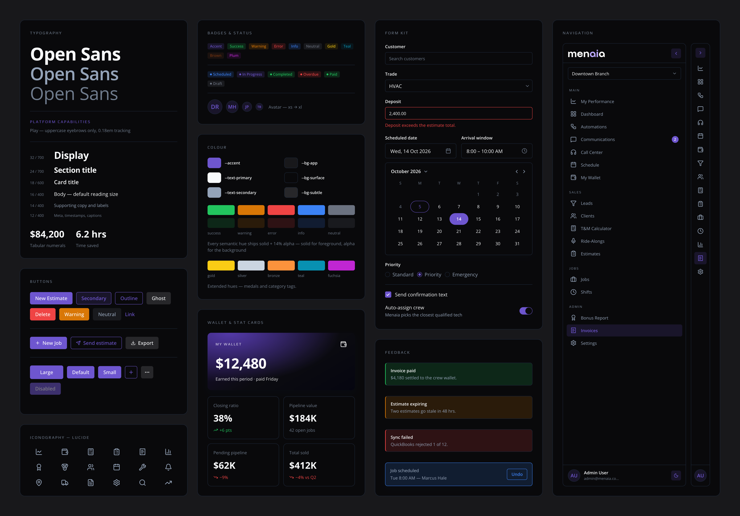
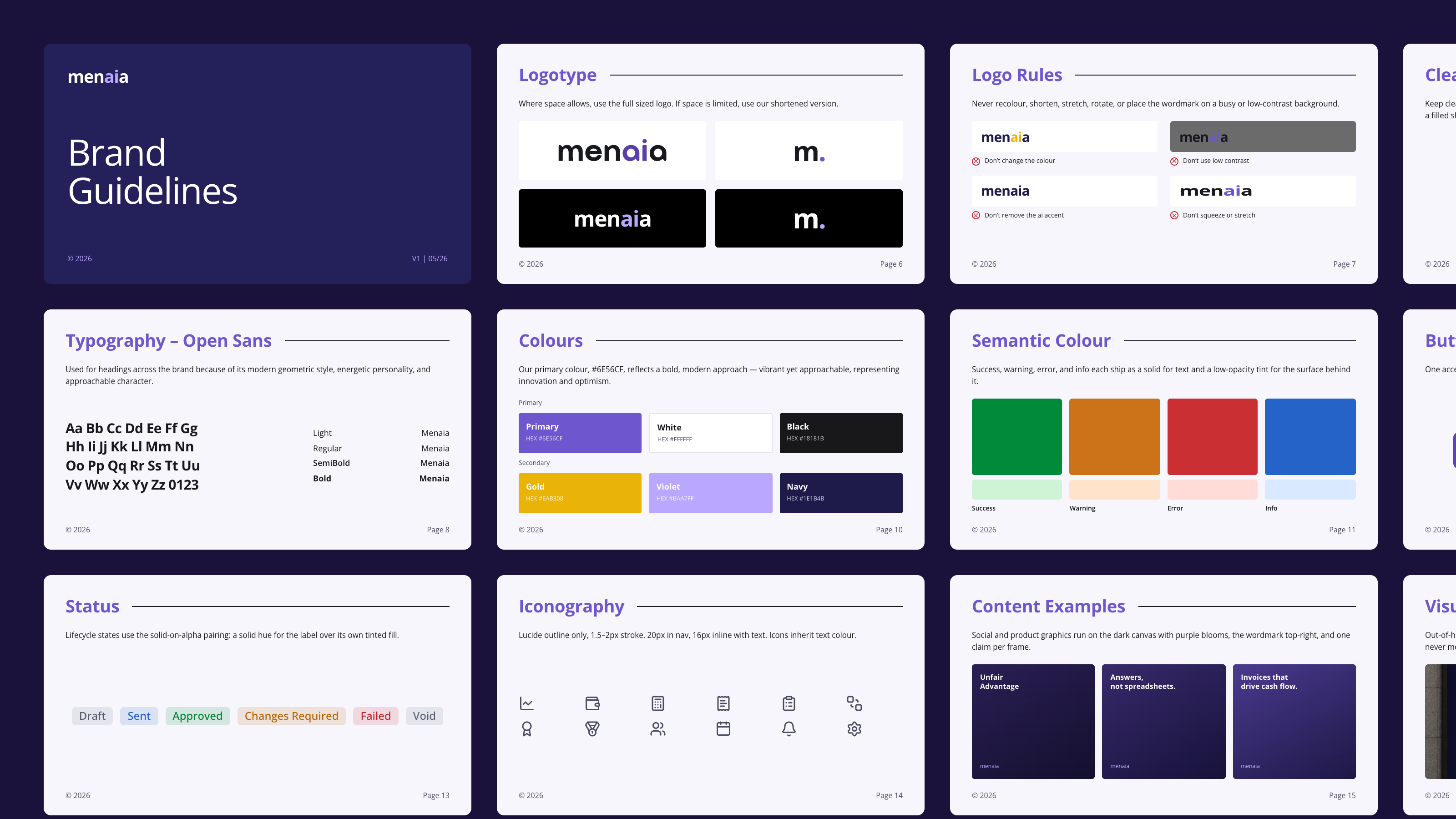
Beyond the app, I put together brand guidelines: logo usage, do's and don'ts, spacing, colour, for anyone outside the team working with the brand.